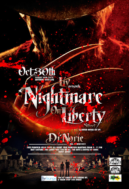
Sunday, October 30, 2011
Wednesday, October 19, 2011
MR. CHEEKS & CRAIG G IN CONCERT
Monday, October 17, 2011
Saturday, October 15, 2011
NATURAL FREAKS APPRECIATION
Friday, October 14, 2011
DRESS 2 KILL (UNOFFICIAL VERSION)
Wednesday, October 12, 2011
NIGHTMARE ON LIBERTY STREET
Tuesday, October 11, 2011
A-LIST LOUIS B'DAY
Sunday, October 9, 2011
Friday, October 7, 2011
THE MUSIC FIRM
Thursday, October 6, 2011
Wednesday, October 5, 2011
Subscribe to:
Posts (Atom)


